CART

A Gantt chart is a view of a schedule, not a schedule. That distinction sounds
pedantic until you meet the project whose plan is a set of coloured bars nobody can recalculate,
drawn once at kick-off and manually nudged rightwards every month until it quietly stops being
updated.
Free gap assessment
How consistently are projects actually run?
A vendor-neutral maturity assessment against ISO 21502, free, so predictive, agile and hybrid teams are scored on the same basis.
Run the free project management maturity assessment → or View premium report sample
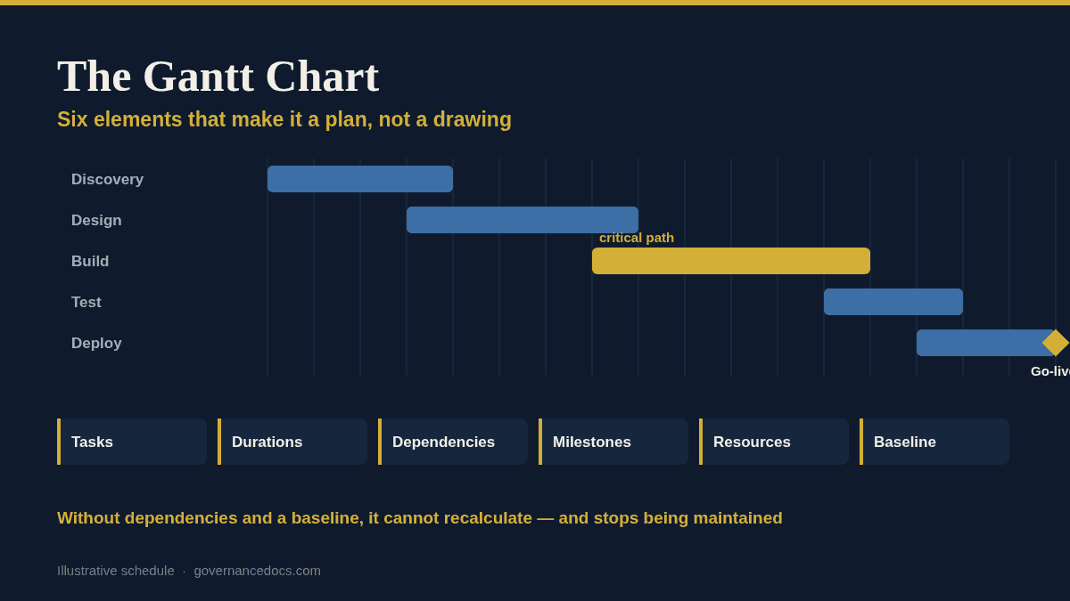
Tasks run down the left, time runs across the top, and each task is a horizontal bar spanning its
start and finish. That is the whole idea, and its usefulness comes from what you layer onto it.
| Element | What it tells you |
|---|---|
| Tasks | The work, broken down far enough to be estimated and owned |
| Durations | How long each takes — effort and elapsed time are not the same thing |
| Dependencies | What must finish before what can start; this is what makes the chart calculate |
| Milestones | Zero-duration markers for the dates other people care about |
| Resources | Who is doing it, and whether they are on three tasks at once |
| Baseline | The agreed plan, frozen, so today’s chart can be compared against it |
A chart with the first two and none of the others is a picture. It cannot tell you what happens if
a task slips, because nothing is connected to anything.
This is the single highest-value thing to get right. Once tasks are linked, moving one moves
everything downstream automatically, and the chart starts answering questions instead of just
displaying assertions. Without links, every slip has to be re-drawn by hand, which is why unlinked
charts stop being maintained by about week six.
Linking also exposes the critical path — the longest chain of dependent tasks, and therefore
the sequence where any delay moves the end date. Tasks off the critical path have float, and knowing
which is which is what lets you decide where to spend attention when something goes wrong.
A Gantt chart without a saved baseline can only ever show you today’s plan. Baseline it at
authorisation — the same moment the
project initiation document is
agreed — and every subsequent view can show planned against actual. That comparison is the
entire reporting value of the chart, and it is unrecoverable if you skip it.
Forty-three scheduling templates, Gantt included.
The Project Management Toolkit ships 390+ editable MS Office templates. The schedule set covers Gantt charts in Excel and Word, an hourly Gantt planner, critical path and master plans in MS Project, PERT chart analysis, milestone charts, a project duration calculator, estimation templates and timeline decks for reporting upwards.
The working chart and the reporting chart are different artefacts, and trying to make one serve
both is why executives get sent 400-line schedules they cannot read.
Keep the detailed chart in a scheduling tool for the delivery team. For the board, produce a
timeline view showing phases, milestones and the current position against baseline — usually a
handful of bars on one slide. Deriving the second from the first takes minutes; maintaining two
independent plans takes forever and they will disagree.
PMI’s PMBOK Guide
reached its Eighth Edition in November 2025, with schedule as one of its seven performance domains,
and ISO 21502:2020
covers scheduling as a practice without prescribing a technique. Neither mandates a Gantt chart —
it is a convention, and a good one, but the requirement is a schedule that can be managed, not a
particular way of drawing it.
Three techniques get conflated because they all touch the schedule, and knowing which does what
saves a lot of confused meetings.
The Gantt chart is a presentation of the schedule against a calendar. It is where
you look to answer “when does this happen?”
The critical path method is a calculation over the dependency network. It answers
“which delays actually matter?” A Gantt chart can display the critical path once it has
been calculated, but drawing bars does not calculate it — the dependencies have to be there
first.
A PERT chart shows the same network as a node diagram rather than against a
calendar, and traditionally carries three-point estimates — optimistic, most likely, pessimistic
— to reason about duration uncertainty. It answers “how confident are we in this
estimate?”
In practice most teams build the network, let the tool calculate the critical path, and present the
result as a Gantt chart. The three-point estimating discipline is worth borrowing even if you never
draw a PERT diagram, because a single-point estimate hides how much you do not know.
It is worth being clear about the limits, because charts project more authority than they earn.
None of that is an argument against Gantt charts. It is an argument for reading them alongside the
risk register, the quality gates and the business case rather than treating the chart as the project.
What is a Gantt chart used for?
Showing what work happens when, how tasks depend on each other, and how actual progress compares with
the agreed baseline.
Do I need MS Project to build one?
No. Excel is perfectly adequate for small and medium projects, and a Word or slide version is often
better for reporting. Dedicated tools earn their place when dependency networks and resource levelling
get complex.
How detailed should a Gantt chart be?
Detailed enough that each task has one owner and a defensible duration, and no more. Plan imminent
work finely and distant work coarsely.
What is the critical path?
The longest chain of dependent tasks through the project. Any delay on it moves the finish date;
delays elsewhere consume float first.
Are Gantt charts useful on agile projects?
At the release and roadmap level, yes — for showing phases, dependencies and external
commitments. For sprint-level work they add little that a backlog and burndown do not already give
you.
A Gantt chart earns its keep when it can recalculate. Decompose the work, link every task, mark the
milestones other people care about, load the resources, baseline it, and then update by recording
progress rather than by dragging bars. Do that and the chart answers questions; skip the links and the
baseline and you have an attractive drawing that will be quietly abandoned by week six. Keep the
detailed version for the team and derive a one-slide timeline for the board from it, rather than
maintaining two plans that will eventually disagree.
All of these are covered by the Project Management Toolkit, or start with the free ISO templates.

October 11, 2026
October 11, 2026
October 11, 2026
October 11, 2026

October 11, 2026