A risk heat map is the single picture most executives see of an organization’s risk, which is exactly why it is worth building carefully. Done well, it shows in seconds which risks sit above appetite and where attention should go. Done badly, it turns a hundred judgment calls into a grid of coloured squares that nobody trusts and nobody can defend.
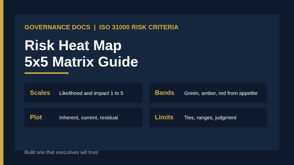
This guide explains what a risk heat map can and cannot show, how to define the scales behind it, how to set colour bands from your risk appetite, how to plot risks before and after treatment, and how to avoid the well-known weaknesses of matrix scoring.
What a risk heat map shows and what it does not
A risk heat map plots each risk on a grid, with likelihood on one axis and impact on the other, and colours the cells by severity. It is a communication tool for a ranked set of risks, not an analysis method in itself. The numbers on it are only as good as the scales and the judgment used to assign them.
ISO 31000:2018, the international guideline on risk management, asks organizations to define risk criteria that reflect their objectives and appetite, but it does not prescribe a matrix or a particular grid size. The standard is guidance rather than a certification scheme, and you can read its scope on the ISO 31000 page on iso.org. So your risk heat map is a design choice, and you should be able to explain every part of it. Our guide to the enterprise risk register covers the records that feed it.
Defining the scales behind the risk heat map
Start with the scales, not the colours. Five levels on each axis is the most common choice because it gives enough resolution without false precision. Whatever size you pick, define every level in words so different assessors reach the same score.
Score
Likelihood (illustrative)
Impact (illustrative)
1
Rare: not expected in the planning horizon
Minor: absorbed within normal operations
2
Unlikely: could occur but no history
Moderate: short disruption or small loss
3
Possible: has occurred in the sector
Significant: needs management intervention
4
Likely: has occurred here or is expected
Major: threatens an objective or attracts regulators
5
Almost certain: expected in the period
Severe: threatens viability or licence to operate
Those wordings are examples. Replace them with thresholds that mean something to your organization, such as financial loss bands tied to your budget, service outage durations tied to your recovery targets, and regulatory consequences tied to your sector. For impact, consider several dimensions at once, such as financial, operational, legal, reputational and safety, and score each risk on its worst dimension.
Score, then rank
The usual scoring rule multiplies likelihood by impact to give a number from one to twenty-five. Multiplication is convenient but it hides information: a risk that is almost certain but minor scores the same as one that is rare but severe. Keep the two component scores visible in your register so readers can tell them apart, and sort by score with impact as the tiebreaker if your appetite is more sensitive to severity than to frequency.
Setting colour bands from risk appetite
The colours are where your appetite becomes visible, so set them deliberately. Agree with senior management which score ranges are acceptable, which need monitoring and which need action or escalation. A typical pattern uses green for scores up to about four, amber for the middle range and red for the top band, but the cut-offs must come from your appetite statement, not from habit. Our guide to risk appetite explains how to set the thresholds.
Tie each band to a required response. Red risks might need executive ownership and a treatment plan within thirty days. Amber risks might need a named owner and quarterly review. Green risks might be monitored through routine reporting. When the colours carry obligations, the map becomes a management tool, not decoration.
Plotting inherent, current and residual risk
One dot per risk is not enough. Plot the inherent position, before any controls, the current position with existing controls and the target residual position after planned treatment. Showing the movement between them lets executives see whether your controls are working and how much further you need to go. Our explainer on inherent versus residual risk defines the terms.
Use two or three separate views instead of one crowded chart. A current-position view for the whole enterprise, a target-position view for planned improvements, and separate views for each major category, such as strategic, operational, compliance and technology risk, keep each picture readable. Number the dots and cross-reference them to the register so readers can look up any point.
A worked scoring example
Consider three hypothetical risks scored on the illustrative scales above. A key supplier failing is rated likelihood 3 and impact 4, giving a score of twelve and an amber position. A ransomware attack on the main platform is rated likelihood 3 and impact 5, giving fifteen and a red position. A minor regulatory filing error is rated likelihood 4 and impact 2, giving eight and an amber position. On a plain score ranking, the filing error sits close to the supplier failure, yet the two have very different consequences, which is why the register should always show the component scores and a short rationale.
Now add treatment. After a second supplier is contracted and tested, the supplier risk drops to likelihood 2 and impact 3, a score of six. Immutable backups and tested restoration might bring the ransomware risk to likelihood 2 and impact 4, a score of eight. Plotting the before and after positions on the map shows executives what the investment buys, and lets them ask whether the remaining amber and red positions are acceptable.
The limits of a risk heat map
Matrices have known weaknesses, and it is worth stating them in your methodology note. A frequently cited 2008 paper in the journal Risk Analysis, “What’s wrong with risk matrices?” by Louis Anthony Cox Jr., argues that matrices offer poor resolution, can rate some smaller risks as more severe than larger ones, and depend on subjective categorization.
You do not need to abandon the tool, but you should compensate for its limits.
Avoid false precision. A score of twelve is not meaningfully different from eleven.
Watch ties. Many risks land on the same cell, so use secondary sort rules and commentary.
Quantify the top risks. For the few risks that dominate, estimate loss ranges rather than relying on a colour.
Calibrate assessors. Run workshops where teams score the same example and discuss differences.
Record the reasoning. A short rationale beside each score makes it defensible.
Presenting the risk heat map to executives
Lead with the message, not the grid. Say how many risks sit in the red band, which have moved since last quarter and what decisions you need. Then show the picture. Limit the main view to the top ten or fifteen risks so it stays legible, and keep the full register available on request. Pair the heat map with your key risk indicator reporting so leaders see leading signals as well as static scores.
Common risk heat map mistakes
Undefined scales. If a “3” means different things to different people, the map is noise.
Colours from habit. Bands should come from appetite, not default templates.
Only one dot per risk. Without inherent and residual positions, nobody sees progress.
Too many risks on one chart. A crowded grid is unreadable.
Scores without owners. Every red risk needs a named person and a date.
Never recalibrated. Review scales after major changes and annually.
Start from a finished risk heat map structure
Designing scales, bands and views from scratch takes agreement across the business. The Enterprise Risk Assessment Report and Workbook gives you a ready structure with a risk register, heat maps, a treatment plan and a live workbook to adapt to your own criteria. You can also compare approaches in our guide to ISO 31000 versus COSO ERM.
Risk heat map FAQ
What size should a risk heat map be?
Five by five is the most common because it balances resolution and simplicity, but three by three or four by four can work for smaller organizations. Choose one size and use it consistently. Changing the grid mid-year makes trend comparisons meaningless, so record the choice and the reasons in your methodology note.
Is a risk heat map required by ISO 31000?
No. ISO 31000 asks you to define risk criteria but does not require a matrix. A heat map is one common way to apply and communicate those criteria.
Should the heat map show inherent or residual risk?
Both are useful. Show current and target residual positions for management decisions, and keep the inherent position in the register so readers can see the effect of controls.
How often should the heat map be updated?
Update it whenever the register changes and present it at each regular risk review, typically quarterly. Recalibrate the scales themselves after major organizational change and at least annually.